2015 – Album Colors Of The Year
Album colours displays album art based on the colour palette from pink to red to green to blue all the way to black and white and the rainbow.
It looks very neat and just to see the all the artwork next to each other is pleasing to my beauty-smelling senses.
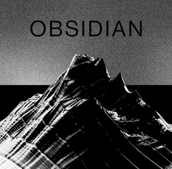
There is a surprisingly high number of black and white colours, it doesn’t look like that when I take a fleeting look in the record shop but some of my favourites are here, like this Obsidian cover which is full of dark feels.
The site also helpfully notes the code of the main colours. A quirky detail we didn’t know we needed.
Which cover caught your eyes and how did you feel scrolling through the shades?


The second/middle cover attracted me most.
LikeLike